ShopDreamUp AI ArtDreamUp
Deviation Actions


Description
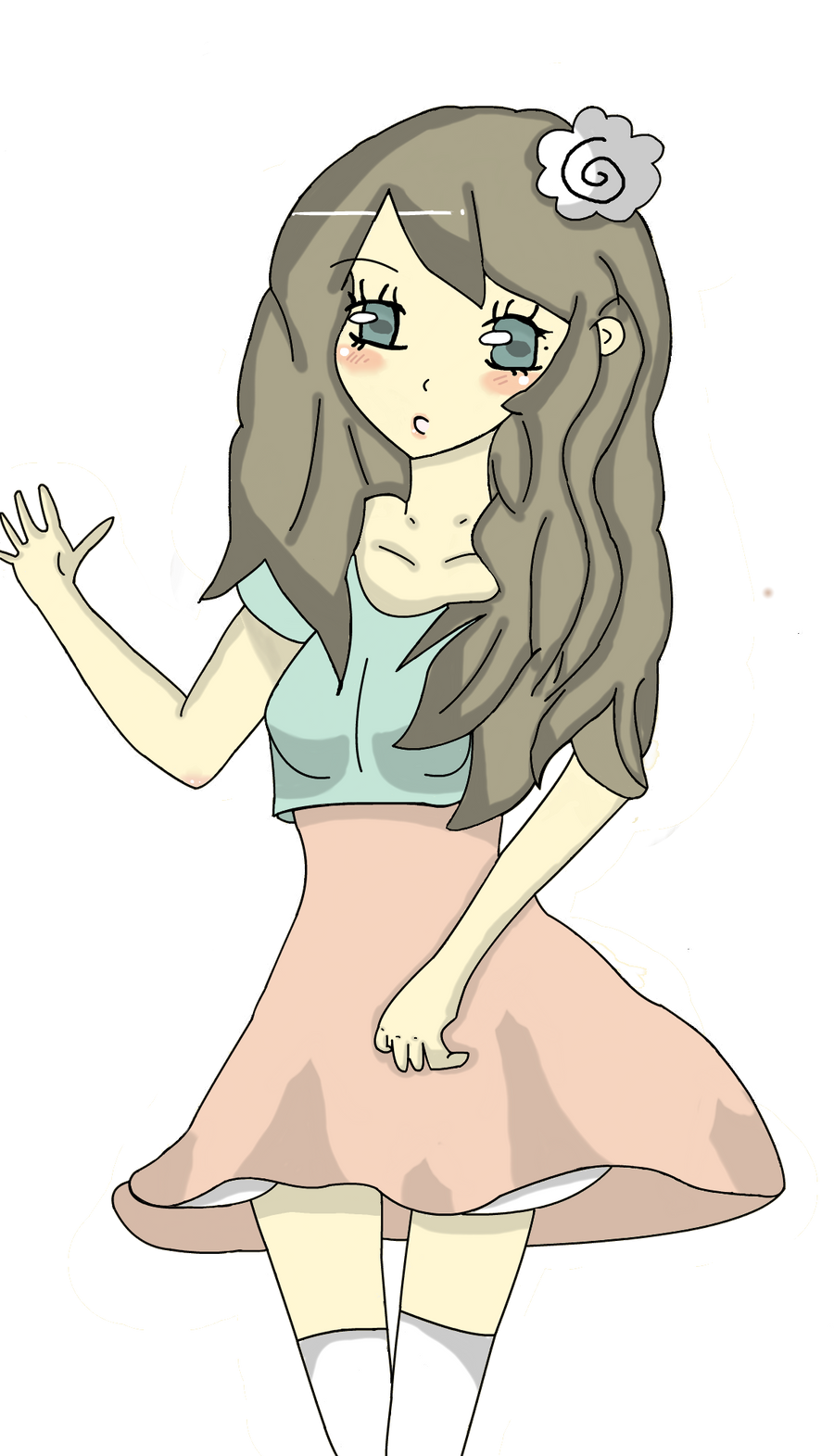
Ok this is my first attempt making something with my tablet... I mean it's not THAT bad for a beginner.... so the drawing was originally for my  app, so ya that's wats it's for. Her name is Chai.
app, so ya that's wats it's for. Her name is Chai.Image size
1160x2024px 423 KB
© 2011 - 2024 Akai--Apple
Comments15
Join the community to add your comment. Already a deviant? Log In
First off, this is a great first attempt with a tablet! You've gotten way better with anatomy and shading since I've seen you last!
Since I've already mentioned anatomy I'll start with that. The head is titled kind of funny for the pose, if I were going to tilt the head to the right, I'd move the neck/ body a little to the right as well. While we're talking about heads, I might as well start talking about the hair. I like how you did the shine in the hair, though next time maybe you'll consider highlighting the clothing as well. The hair is laid a little weird over the left shoulder, and the hair curves in an awkward motion near the top of the blouse on her right. One last word on anatomy... I like how you showed the skin stretching over the shoulder bones and thumb joint, but maybe make the thumb a little smaller ^^
Skin... pretty good, except it lacks... color. Do you get what I'm saying? Most skin isn't just shades of tan, there's red and brown and sometimes oranges and purples!
The clothing, the way it hangs around her legs isn't consistent, part can't be blowing forward while part is blown back. The line under the left breast is placed a little wrong, so it looks as if the blouse is tight on one side, and loose on the other, and that line between the breast looks pretty weird.
Last words, shading. Try to add more highlights, and blur the shading at the edges so the transition between colors isn't so abrupt.
But yeah, this is my favorite piece of yours, I really like it ^^